

Design System Guide for Growing Product Teams
Build a practical design system with shared principles, tokens, accessible components, documentation, governance, adoption, and measurable outcomes.
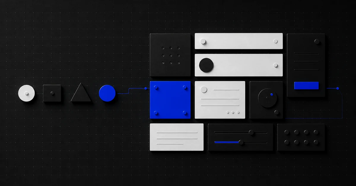
A design system can make a product team faster, more consistent, and more accessible. It can also become an expensive component gallery that everyone praises and nobody uses.
The difference is not the polish of the documentation site. A useful system solves repeated product problems, connects brand decisions to working interfaces, and gives designers and developers a shared way to improve those decisions over time.
This design system guide explains how to decide whether you need one, what to include first, how to introduce it without stopping product delivery, and how to measure whether it is creating value.
What a design system is—and is not
A design system is a maintained set of principles, foundations, reusable components, guidance, and contribution practices that help teams create coherent digital products.
It may include:
- Product and design principles
- Color, typography, spacing, motion, icon, and layout foundations
- Semantic design tokens
- Reusable design and code components
- Accessibility and content guidance
- Patterns for common multi-step tasks
- Documentation, versioning, and contribution processes
A component library is one part of that system. A Figma file, CSS framework, or page of brand colors is not enough on its own because none explains when a solution should be used, how it behaves, or how it changes safely.
The U.S. Web Design System's maturity model is a helpful reminder that adoption can be incremental: teams can align on principles and guidance before using every token and code component.
Decide whether the timing is right
Do not build a design system just because mature companies have one. Build it when repeated inconsistency is creating a measurable product or delivery cost.
Strong signals include:
- Multiple teams repeatedly design and build the same controls.
- Similar components behave differently across journeys.
- Brand updates require manual changes in many repositories or files.
- Accessibility defects recur because correct states are not reusable.
- Designers and developers spend substantial time translating the same decisions.
- New team members cannot tell which patterns are current.
- Several products need continuity without becoming visually identical.
Delay a large system effort when the product direction changes weekly, only one small team ships the interface, or there is not yet enough repeated experience to identify stable patterns. In that case, establish a light foundation and extract components from real product work.
Estimate the opportunity with a simple inventory. For four weeks, record repeated design questions, duplicate implementation, visual regressions, and recurring accessibility fixes. That gives the system a baseline and prevents “consistency” from becoming an unmeasurable objective.
Start with a design system brief
Write a one-page brief before opening a library file.
Problem
What repeated cost or quality issue should the system reduce? Name examples and evidence.
Consumers
Which products, teams, technologies, and user groups will use it? A marketing site and complex operations tool may share foundations but need different patterns.
Outcomes
Choose a few measurable goals, such as:
- Reduce time to implement common authenticated screens.
- Increase use of accessible, tested form controls.
- Reduce visual and interaction regressions.
- Make a brand change possible through semantic tokens.
- Improve continuity across related products.
Boundary
State what the first release will and will not cover. “Foundations plus the six most repeated form and feedback components for the web app” is a credible boundary. “Every component for every platform” is not.
Ownership
Name the maintainer, product sponsor, engineering owner, design owner, and representatives from consuming teams. A volunteer side project rarely survives competing deadlines.
Translate brand strategy into interface foundations
Brand is not a hex-code handoff. Positioning and personality should guide how the product communicates, moves, prioritizes, and earns trust.
Before defining visual foundations, clarify:
- What the brand promises and to whom
- Which qualities the experience should express
- What must remain consistent across marketing, product, and support
- Where product usability should override expressive styling
- Which accessibility and internationalization constraints apply
If those decisions are missing, use the brand strategy guide first. Otherwise, the design system will formalize visual preferences without a reason.
Turn foundations into semantic roles. Instead of naming a token blue-500, use roles such as color-action-primary, color-text-muted, or color-status-critical. The raw palette can change while the intended meaning remains stable.
Use the same approach for:
- Typography:
text-heading-page, not onlyfont-size-32 - Spacing: roles or a documented scale, not arbitrary pixel values
- Elevation: meaning such as overlay or raised surface
- Motion: feedback, transition, attention, and reduced-motion behavior
- Layout: content width, grid, density, and responsive rules
Semantic tokens do not replace judgment. They make judgment visible and repeatable.
Prioritize components from real product usage
Inventory the interface before designing an ideal library. Group similar examples and note where appearance, behavior, terminology, or code diverges.
Score component candidates by:
| Factor | Question |
|---|---|
| Frequency | How often does this appear across important journeys? |
| Risk | Can inconsistency cause accessibility, financial, privacy, or task failure? |
| Duplication | How many teams have implemented a version? |
| Stability | Is the underlying interaction understood and unlikely to change immediately? |
| Leverage | How many other patterns depend on it? |
Buttons may be common, but form fields, validation, alerts, dialogs, and tables often create more operational value because their states are harder to implement well.
Begin with a thin vertical slice: tokens, a small group of components, documentation, design assets, working code, tests, and adoption in one real journey. This tests the whole system operating model before the catalog grows.
Document behavior, not only appearance
Every component page should answer:
- What problem does this solve?
- When should and should not it be used?
- What content does it require?
- What are its default, hover, focus, active, disabled, loading, success, and error states?
- How does it respond to small screens, zoom, long text, and localization?
- What keyboard and screen-reader behavior is expected?
- Which properties can consumers change?
- What analytics, privacy, or security considerations apply?
- What are tested examples and known limitations?
Use plain examples from real product scenarios. “Save changes” teaches more than “Button label.” Include long names, empty results, destructive actions, validation failures, and delayed responses.
Accessibility acceptance criteria should live beside the component, backed by automated and manual tests. Follow the current WCAG 2.2 standard for testable requirements, while remembering that conformance does not replace research with disabled users.
Separate components from product patterns
A date input is a component. Booking an appointment is a pattern involving content, validation, time zones, availability, confirmation, change, and cancellation.
Document patterns when teams repeatedly assemble components to solve the same user task. Examples include:
- Account creation and sign-in recovery
- Search, filter, and no-results behavior
- Multi-step forms and save-and-return
- Destructive actions and confirmation
- Permission requests and access denial
- Upload, progress, failure, and retry
- Notifications and preference management
Patterns preserve product reasoning that isolated components cannot. They also expose gaps: a library may contain polished inputs but no coherent way to explain a failed submission.
Design governance that teams can use
Governance answers who decides, how contributions happen, and what changes when consumers disagree.
Use a lightweight contribution path:
- A team identifies a repeated need and shares product evidence.
- Maintainers check for an existing component or pattern.
- The contributor proposes behavior, content, accessibility, and technical requirements.
- Design and code are reviewed with at least one consuming team.
- The change is documented, tested, versioned, and released.
- Adoption feedback informs the next iteration.
Not every need belongs in the shared core. Allow product-level composition when a pattern is specific, still changing, or not proven across contexts. Promote it later if reuse becomes real.
Publish expected review times and a way to request help. Teams route around a design system when contribution feels slower than rebuilding.
Version, deprecate, and communicate change
Consumers need to know what changed and what action to take.
- Use predictable versions for code packages and design libraries.
- Separate breaking changes from additions and fixes.
- Publish release notes written for product teams, not only maintainers.
- Provide migration instructions and examples.
- Mark deprecated components in design and code.
- Set a realistic support window before removal.
- Track which products use high-risk components.
Avoid silent visual changes to foundational tokens. A small contrast or spacing change can affect hundreds of screens, screenshots, or workflows. Test the system and representative consuming products before release.
Introduce the system through product work
Adoption is a migration, not an announcement.
Choose a product journey with repeated components, an engaged team, and meaningful but manageable scope. Pair system maintainers with that team, replace or improve the relevant patterns, and document what the migration reveals.
Then provide:
- Starter templates and installation guidance
- Clear supported platforms and versions
- Design-to-code naming that matches
- Office hours or an owned support channel
- Examples of successful adoption
- A plan for legacy components and exceptions
Do not require a full rewrite to gain value. Replace components during planned product changes and fix severe accessibility or risk issues earlier. The website redesign checklist can help when adoption is part of a broader rebuild involving content, URLs, analytics, and launch risk.
Measure design system outcomes
Catalog size and documentation visits are activity measures. Pair them with outcomes:
Adoption
- Percentage of target products using supported foundations and components
- Usage by component and version
- Number and age of unsupported forks
Delivery
- Time from approved design to working implementation for common patterns
- Duplicate component work avoided
- Time to apply a foundation or accessibility improvement across products
Quality
- Accessibility and visual regressions in shared versus custom components
- Repeated usability defects in system-covered patterns
- Consistency of terminology and interaction behavior
Team experience
- Time to find a suitable solution
- Contribution turnaround time
- Consumer confidence and recurring support questions
Use the original baseline and review quarterly. If adoption stalls, investigate whether the problem is product fit, documentation, technical compatibility, contribution friction, or missing ownership—not whether teams need another launch presentation.
A practical 30-day starting plan
| Week | Focus | Deliverable |
|---|---|---|
| 1 | Interview teams and inventory repeated patterns | Brief, baseline, and candidate list |
| 2 | Agree principles, naming, foundations, and first slice | Token model and acceptance criteria |
| 3 | Build design and code components with documentation | Tested alpha package |
| 4 | Adopt in one real journey and review evidence | Release, migration notes, and next priorities |
The goal is not a complete system in 30 days. It is proof that the system can move from product evidence to shared design, working code, documentation, and adoption.
Frequently asked questions
How many components should a design system start with?
There is no correct number. Start with the smallest set that solves a meaningful repeated workflow and tests your design-to-code, documentation, release, and contribution process. Six well-adopted components are more valuable than sixty disconnected examples.
Who should own a design system?
A named cross-functional core team should maintain it, with an accountable sponsor and participation from consuming product teams. Design-only ownership creates code gaps; engineering-only ownership can miss user and content needs. Ownership also needs allocated time, not goodwill.
Build shared judgment, not just shared assets
A strong design system helps teams make repeated decisions with less waste and better outcomes. Its real product is not the button library. It is the shared language connecting brand, user needs, accessibility, design, and engineering.
BroadBrander's branding and strategy and product design services can help shape that foundation and turn it into an adoptable interface system. Or tell us where inconsistency is slowing your team down.
UX Audit
UX Audit Checklist: Find Friction Before Redesigning
Use this UX audit checklist to combine task review, accessibility, analytics, research, and a severity score into an evidence-based action plan.
Read article
API Integration
API Integration Checklist for Reliable Connections
Use this API integration checklist to plan ownership, security, retries, webhooks, testing, monitoring, reconciliation, and a safer go-live.
Read article
Landing Pages
Landing Page Checklist for Better Conversions
Use this landing page checklist to align intent, clarify the offer, add credible proof, reduce form friction, improve speed, and measure conversions.
Read article